Congratulations for the new look. The HFV logo on the top left side looks out of place in the revamped portal. I would suggest to change the font of the logo to match the overall font of the forum and also remove the back ground blue color and make it transparent so that the logo gels with the new look. Rest all other things look great and this is a refreshing change due for a long time now.
You are using an out of date browser. It may not display this or other websites correctly.
You should upgrade or use an alternative browser.
You should upgrade or use an alternative browser.
Welcome to the new upgraded forum.
- Thread starter HiFiVision
- Start date

- Status
- Not open for further replies.
HiFiVision
Super Moderator
Thanks for the feedback. Yes, we intend to change the logo. If any member would be willing to volunteer to make a new logo design or image that would help.Congratulations for the new look. The HFV logo on the top left side looks out of place in the revamped portal. I would suggest to change the font of the logo to match the overall font of the forum and also remove the back ground blue color and make it transparent so that the logo gels with the new look. Rest all other things look great and this is a refreshing change due for a long time now.
keith_correa
Well-Known Member
Another suggestion is to position the poster handle and date of the post at the top of the post instead at the bottom where it is currently. More visiblity.
reachkalyan.kr
Well-Known Member
Today again there is a change in interface
HiFiVision
Super Moderator
Yes some changes based on the feedback received.Today again there is a change in interface
Dr.Lakshay
Active Member
This latest update is really very good.
HiFiVision
Super Moderator
No not as yet.Is Tapatalk enables?
reubensm
Well-Known Member
The new site is quite good and modern, getting used to it. More features, nice.
Dr.Lakshay
Active Member
You don't need a multi quote option sir. You just click on reply on as many posts you want and the quotes keep on getting added in the reply.I see the layout is slightly different today. I could not find a way to Multi quote during a reply. Is the option hidden somewhere?
MaSh
Thanks for the feedback. Yes, we intend to change the logo. If any member would be willing to volunteer to make a new logo design or image that would help.
The best way to do this will be to post a Small write up of what the logo should convey.
"Audio Video related "
"Passionate Members"
etc. this will help designers know what to make. Especially since there is no direct contact with Forum owners.
As for feedback of the new look and feel, yes its modern and at the same time intuitive. like all things new it will take time to get used to it, yes the old one was retro and easy on the eyes but this one too will grow on us..
One thing that is needed is to have the HIFIVISION logo file (Favicon.ico) put up that way the tab in the browser can easily be identified that its a Hifivsion tab.
elangoas
Well-Known Member
Yes, we intend to change the logo. If any member would be willing to volunteer to make a new logo design or image that would help.
I have no experience with graphics (or) logo creation..
I thought of an idea.. HiFi letters as in a digital equaliser ..Something like this image - But static horizontal tri colours.
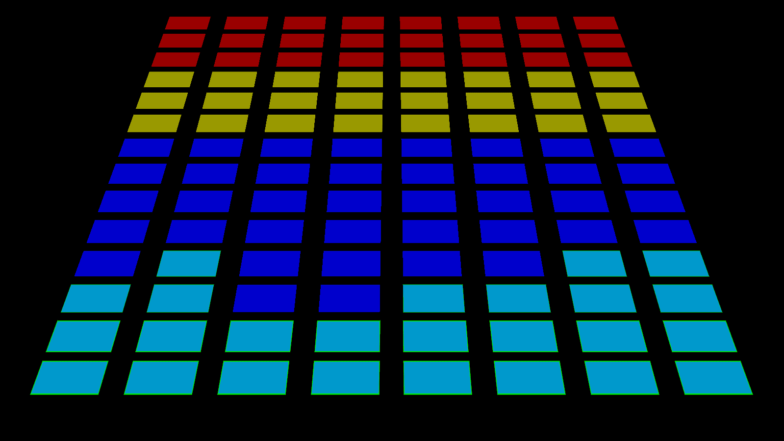
and Vision letters, probably illusioned in colours.. Something like this..
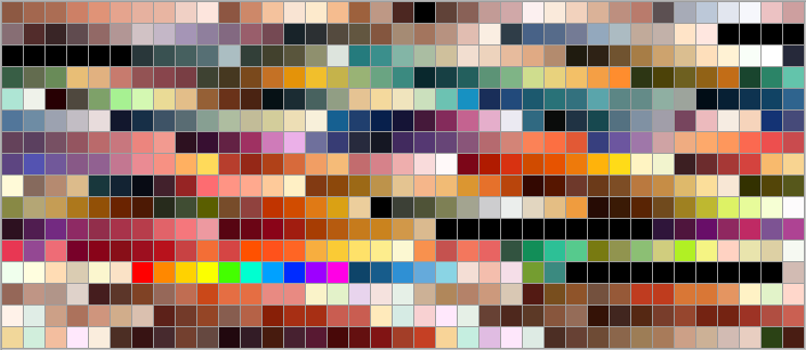
I feel it represents both audio & video in a different way.. Juz my thoughts..
HiFiVision
Super Moderator
I have no experience with graphics (or) logo creation..
I thought of an idea.. HiFi letters as in a digital equaliser ..Something like this image - But static horizontal tri colours.
and Vision letters, probably illusioned in colours.. Something like this..
I feel it represents both audio & video in a different way.. Juz my thoughts..
Will have to figure out how it can be incorporated on a logo.
Looks great with the second update. Far more mobile friendly to boot. Don't really miss Tapatalk any more.
Do you plan to keep the white background? The light blue was much more soothing to the eyes.
Do you plan to keep the white background? The light blue was much more soothing to the eyes.
It would be nice to be able to edit what we just posted (within one hour like earlier).
Another feature worth emulating from www.diyaudio.com is the ability by the OP to continually edit post#1. This is useful to post latest updates in long threads, right on the first post, or include a link to the relevant post# in post#1 for important information/updates. Members can easily find relevant info without having to plough through pages and pages of posts.
PS: I personally like the current layout and colour combo.
PPS: the website has become blazing fast.
PPPS: congrats Supermod on bringing about such a drastic improvement - two thumbs up!
I think that feature is still there.It would be nice to be able to edit what we just posted (within one hour like earlier).
It would be great if the OP can have a longer window to edit the thread title. Many times there are some spelling or similar mistakes.
I think that feature is still there.
Okay, I just figured that out. Thanks. Tiny drop down arrow right of "Report" at bottom left of post window.
aashish351
Well-Known Member
Can't figure out how to close (own) thread. Is the feature gone?
- Status
- Not open for further replies.
Purchase the NEW Audiolab 6000A MkII Integrated Amplifier at a special offer price.
Similar threads
- Replies
- 8
- Views
- 1K
- Replies
- 32
- Views
- 15K
- Replies
- 24
- Views
- 25K
- Replies
- 4
- Views
- 4K
- Replies
- 5
- Views
- 6K